![]() MADE IN EUROPE
MADE IN EUROPE


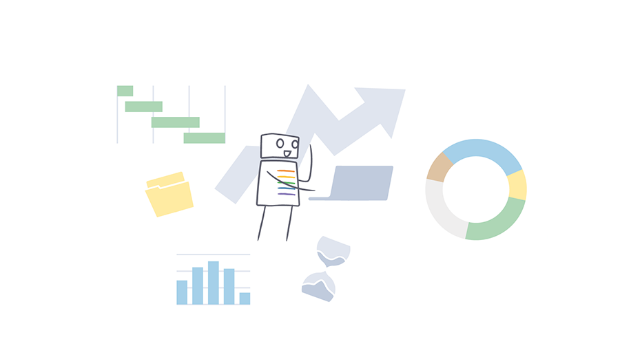
How we improved the user experience thanks to the graphical interface
What we see with the naked eye of a digital product is its graphical interface and the contents of any kind that populate it. We tend to believe that this is the main part of a product, as Pareto’s law teaches us: 20% of the work brings 80% of the results. Obviously we know that the engine of a product is its fundamental part, its heart, but it is difficult to convey this value without an in-depth UX and UI study that makes the product pleasant and perfectly usable for users.
We experienced this phenomenon on our skin when SolidRules still had an interface that we can define "rudimentary", a little vintage someone would say.

We noticed that even under the hood of SolidRules there was a nice engine, its body was not very trustworthy. We realized that a great product with a bad graphical interface simply can’t be considered a great product because the market will certainly fail it.
In this article we want to tell you in more detail the importance of a good graphical interface based on our experience and we will also tell you about the evolution and improvements made in SolidRules that made it what it is today. Also, we will tell you something about the future direction.
What is a UI and how it works
When we talk about UI we mean the meeting point between user and digital product, such as a website or an App.
The UI is the visual part and consists of graphic components designed to ensure easy consultation of data and visual cohesion within our product.
But it is not enough that the interface is pleasant, it will be built to facilitate the user to achieve its objectives in the shortest possible time and without cognitive efforts. This is made possible by a set of user-focused activities from which we can get data that will help us direct the interface towards the needs of the user, collecting feedback from users and continually iterating solutions. These activities are called user experience (UX).

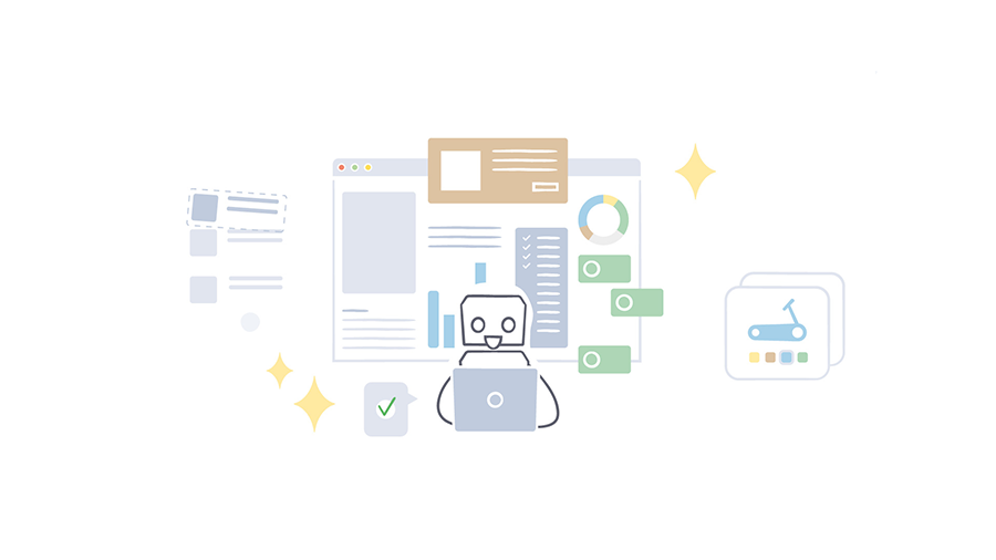
Case Study: SolidRules and UI Improvement Results
For those of you that already know us, this will be a brief review, for those that are new here we will explain briefly what SolidRules is and what it does through this example.
Imagine a company that produces elevators, it is likely to consist of:
- Commercial office
- Technical Office
- Production
- Service and maintenance
- Spare parts office
- And other
Now imagine that the company has bought 10 different software to manage 10 departments; then, it will have 10 suppliers to interface with, 10 products on which to form and keep up to date the organic, etc... crazy right?
SolidRules is a suite of products that allows you to manage all departments from a single point. So that company can continue to produce elevators using only one product and focusing on the important things.
Starting from the estimate, through the offer and design to the production and after-sales. This is the whole universe SolidRules is about. And as you can imagine, bringing together and collaborating all this information in one place in an organized and easy-to-navigate way was quite a challenge.
But we believe so much in SolidRules that before delivering it to you we try it on our skin in everyday life, and the same happened for the changes to the graphical interface.
Continue reading to find out what these changes were and what impact they had on the use of the product.

How a graphical interface can improve the performance of a digital product
Moving on to the practical aspect, the product and its features have evolved over the years, as has the graphical interface that has been adapted from time to time to keep up with SolidRules and user needs.
Some of the first difficulties were related to performance problems: all the information (and we manage a lot of it) of a page were loaded in one fell swoop and this caused slowness therefore impossible to work efficiently.
Here came the first design pattern that still characterizes the screens of SolidRules: the tabs.
By organizing the data into containers and loading it only when needed, the page load time has dropped considerably. This intervention was useful not only for the performance, but also in terms of information architecture: the data were grouped intuitively in macro-sections, reachable without having to scroll along the page in search of the exact point.
The introduction of tabs also managed to provide a hierarchical organization to the page, but this change was still not enough.

Design that avoids loss of context
It is the turn of the data tables (data table), the protagonists not only for the frequency with which we use them but also for their size. An endless list of elements from which we had to open and consult one element at a time on a new page and then return to the table. The continuous shift from one page to another caused loss of context, especially when you had to do it many times.
In this case we iterated the design by inserting a button on each row of the table that can open a preview of the item on the click without the need to change the page.
A similar case was that of forms. You are filling out your form and at the "confirmation" a window shows you a list of errors, close it to solve them and... the list is gone. Of course every field in error is marked by a red border lower, but you have to pass it with the mouse to read the message. Not to mention fields outside the field of view, at the bottom of the page or in tabs.
The proposal in this case was to insert the list of errors in a banner at the top of the page, always visible and accessible by the user.
This applies to both errors and other types of messages. For example, the confirmation of a successful operation managed with a window that suddenly appears blocking what you were doing, will interrupt your workflow and make your cognitive load difficult. It is a window that appears for a few seconds, but every second counts.
The most suitable solution in this case is an element called toast (no, not that toast): a message that appears near the edges of the screen for a few seconds. You notice it, you read it, you continue with your work without having to interact with the message to close it.

Understandable and easy to find information
Competing with the complexity of tables, there are menus. The actions you can do on a page are countless and finding the one you’re looking for in seconds is crucial. Our menus consisted of a series of buttons with a different icon for each function. Up to 5 buttons were fine, but interpreting and remembering the function of many icons was starting to be a problem.
To reduce this friction, labels have been added to the icons and buttons have been organized and classified into menu items and subheadings. In this way the function of the actions has become clearer and the main actions have been highlighted, placing the secondary actions in blinds that can be opened at the click.

There is no consistency without a Design System
A usable product should not be interpreted every time you use it, we must be able to recognize its interface instead of trying to remember it.
This is achieved by ensuring that the elements in a user interface are uniform and behave in the same way to create a sense of control, familiarity and reliability in the user.
You can thus resort to the user interface library, a collection of items of the same style ready for use. But having the pieces is not enough, you need to know how to use them.
And here comes into play the Design System, a platform as a single point of reference for all stakeholders, including designers and developers, to draw on for any type of business guidelines. Also for the interfaces.
At the time of writing this article the SolidRules Design System is in its infancy, but soon we will come to a solid solution to rely on.

The user at the heart of design choices
We have seen how an interface can evolve to meet the needs of those who use it, changing needs that must be identified continuously to obtain an ever better user experience (UX).
And while on the one hand we have the analysis of the requests of our target, on the other we have the design of the visual part that has the task of maintaining consistency and transmitting familiarity to the user who observes it (UI).
This is just a starting point of our journey to make SolidRules easy to adapt to your needs.
SolidRules interests you (or you are already trying it) and there are aspects about usability that do not convince you?
Let’s talk about it!

More by Alexide

Are you ready for the Big Data era?
Data Management
Any question? We are here for you.
Fill out the form or send us an email to info@solidrules.com. We will contact you to provide you all the solutions.